Undervalued Japanese Stocks

Overview
Scraping P/B ratios of 225 stocks in the Nikkei Index and graphing their composition ratios.
What is P/B Ratio?
P/B Ratio is Price to Book Value Ratio.
P/B Ratio = Market Price per Share/ Book Value per Share
The smaller the value, the more undervalued it is.
In Japan, it is called "PBR" instead of "P/B Ratio" and "PER" instead of "P/E Ratio".
List of Nikkei 225 Stocks
Scraping and listing with puppeteer.
Install puppeteer.
npm i puppeteerGet the list of stocks from this site.
日経平均プロフィル
I looked at the HTML of the website and found the target class.
class="row component-list" looks good.
<div class="row component-list">
  <div class="col-xs-3 col-sm-1_5">4151</div>
  <div class="col-xs-9 col-sm-2_5">
    <a href="https://www.nikkei.com/nkd/company/?scode=4151">協和キリン</a>
  </div>
  <div class="hidden-xs col-sm-8">協和キリン(株)</div>
</div>
To be a little more specific, I decided that the separator should be "body > div.container > div.col-xs-12.col-sm-8 > div.row.component-list".
The following code created a list of ticker symbols and names.
type Item = { ticker: string; name: string };

async function crawl225(): Promise<Item[]> {
  const browser = await pupeteer.launch({ headless: false });
  const page = await browser.newPage();

  const results: {
    ticker: string;
    name: string;
  }[] = [];

  try {
    const url = "https://indexes.nikkei.co.jp/nkave/index/component";
    await page.goto(url);
    const selector =
      "body > div.container > div.col-xs-12.col-sm-8 > div.row.component-list";
    const rows = await page.$$(selector);

    for (const row of rows) {
      const divs = await row.$$("div");
      const ticker = await (
        await divs[0].getProperty("textContent")
      ).jsonValue();
      const name = await (await divs[2].getProperty("textContent")).jsonValue();
      if (ticker && name) {
        results.push({ ticker, name });
      }
    }
  } catch (err) {
    console.error(err);
  } finally {
    await browser.close();
  }

  return results;
}
P/B ratios for each stock can be found on common stock sites such as yahoo finance.
Plotting the result on a chart
Let's divide the stocks into the following three categories and give their composition.
- Less than P/B ratio 1
- P/B ratio 1 or more and less than 2
- P/B ratio 2 or more
I Use Python from here and display graphs with matplotlib. First, conver the acquired data to DataFrame.
import pandas as pd

df = pd.DataFrame(items, columns=["ticker", "name", "pbr"])
df["pbr"] = df["pbr"].astype("float")
You can extract rows with specific conditions by using query.
values = [
    len(df.query("0 <= pbr < 1")),
    len(df.query("1 <= pbr < 2")),
    len(df.query("2 <= pbr")),
]
print(values) #[119, 68, 39]
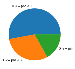
Create a pie chart using matplotlib.
import matplotlib.pyplot as plt

labels = ["0 <= pbr < 1", "1 <= pbr < 2", "2 <= pbr"]
data = [119, 68 , 38]

plt.pie(data, labels=labels)
plt.show()

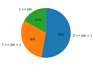
Add some parameters for clarity. startangle: start position. At 90, line up the items the 12 o'clock position on the clock. counterclock: Arrange the items clockwise. autopct: Display composition ratio.
plt.pie(data, labels=labels, startangle=90, counterclock=False, autopct='%.f%%')
plt.show()

Conclusion
About half of the stocks have a P/B ratio of less than 1.